Last weekend I gave a free lettering workshop in Sydney. Attended by 22 eager young designers, the class explored the process of designing and refining a piece of hand lettering from start to finish.
Free? Did I miss out?
The class was hosted by Shillington College in Sydney, and was free for all current and former Shillington students. Shillington have hosted many of my workshops in the past, across their studio-like campuses in Brisbane, Sydney and Melbourne. Their generosity has allowed me to teach typography and hand lettering techniques to hundreds of students, so I thought it was time to return the favour.
Where Are They Now?
By way of introductions, each student started by stating their name, when they studied at Shillington and what they are up to now. Responses ranged from 18 years ago to present-day, and it was interesting to note that every single participant was working in the design industry in some capacity. There were employees and freelancers, illustrators and UX designers, part timers and full-timers. That’s an extremely high employment rate for graduates, and I wondered how many other design schools could boast such successful outcomes? One thing that sets Shillington apart from many others is their focus on intense, industry-targeted training in an environment which mimics studio conditions. But all the participants were excited to be there, and keen to explore hand-made typography techniques.
Let’s Get Started
Imagine that you were asked to design a logo, but you weren’t allowed to choose a font until the concept was approved (!) That’s the task I gave to my students: take a word or phrase and draw it in skeleton form, like when you drew stick-figures as a child. They were asked to thumbnail sketch as many variations as possible. The objective was to understand construction elements such as flourishes and spatial relationships between letters, without any stylistic choices getting in the way. It’s also an efficiency technique: many of us (myself included!) can’t see the wood for the trees, and we quickly get caught up in detail and embellishment without stepping back to look at the bigger picture. Most students produced 5-10 variations of their piece and—as expected—found it very difficult to design in such a simplistic manner.
Brushpen frenzy
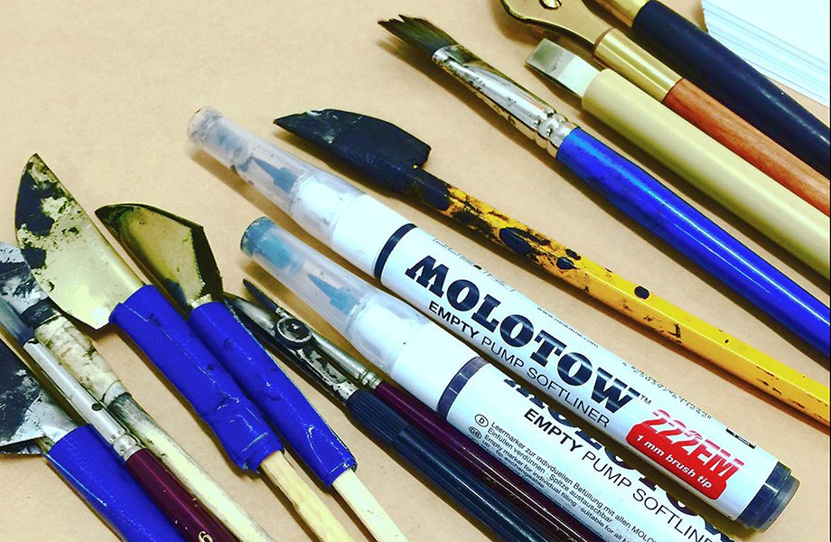
Next, I asked students to put some tracing paper over the top of their skeleton sketches, and re-draw them using a brushpen. A few weeks before the class, I had advised everyone to go shopping, and many participants brought along one of my favourite lettering brushpens, the Tombow. For most designers, the first use of a brushpen is a confusing experience because they are neither a pen nor a paintbrush. So I launched into a series of techniques describing how to hold the pen, how to get the maximum stroke width from the nib, and how to create some basic shapes. Through this exercise, students get a sense of how the nib shape dictates the DNA of a letter. I also showed a fantastic video by Italian master calligrapher Luca Barcellona, a man who makes brushpen lettering seem effortless. Throughout the day, students also had the opportunity to try various kinds of ruling pens I had brought along with me – the kind pictured in the header image – which are used for expressive and sometimes splattery lettering.
Yeah, but how do you make it sing?
I like to collect lettering examples on Pinterest, and I categorise them into different hand lettering techniques such as flourishes, ligatures and letter-fit. By showing these samples on screen and discussing them at length, participants are shown several paths through which they can add style and originality to their piece, as well as helping to ensure it’s legibility. Now it’s up to the students to try and apply those techniques in the context of their own piece, a huge and daunting challenge. Learning restraint is one of the most difficult tasks, and beginners often over-flourish, leading to what I call ‘pubic-hair frenzy’.
Jess brings her Milkshake
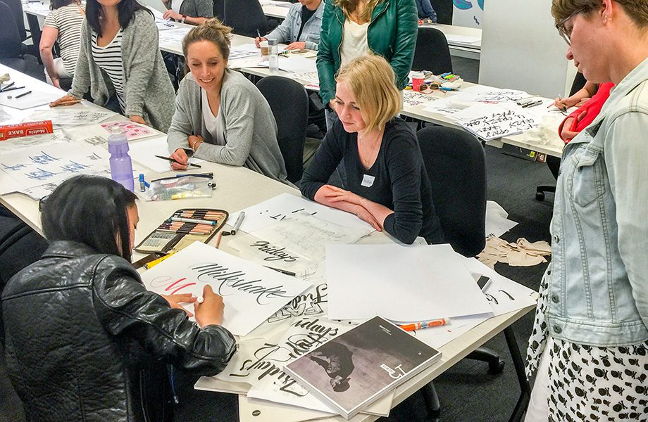
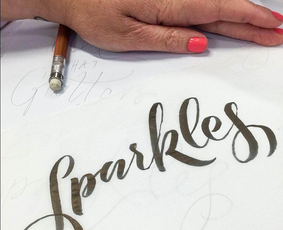
Renowned Sydney lettering artist Jess Cruickshank also kindly donated some of her time and expertise on the day. One of the reasons that Type By Hand workshops are so popular is because participants get one-on-one access to tutors, whose on-paper guidance can be invaluable. Have you ever tried to do an online creative course? Yes, it’s possible, but having one-on-one time is like supercharging an engine! Jess has a gift for demonstration in an accessible way, and many of today’s participants benefitted from her attention. Jess demonstrated her favourite word, Milkshake, to a crowd of eager onlookers.
Jess demonstrates her handlettering with the word Milkshake
Cooking your Lettering
The rest of the afternoon was spent learning the process of refinement using greaseproof paper. No, we’re not baking cookies, but using the greaseproof paper instead of tracing paper, which can be expensive. I like to show students how to refine their piece through multiple versions which mix both brushpen (for expressive lettering shapes) and pencil (for finer detail). Participants like to think you start and finish a work on the same piece of paper, but are often surprised to find that the professionals might do 8-10 versions of their piece before it’s complete. The greaseproof paper method is a means to an end – a way of making small adjustments to letter spacing, size relationships and flourishes without the smudging mess of an eraser. But there’s a secret bonus that nobody considers too: when finished, you have done your lettering 10 times instead of once, making you ten times better!
Using greaseproof paper as tracing paper to do revisions.
One big happy family
At the end of the day, we took a group photo to commemorate the occasion. There were 20 tired but smiling faces, all ready for a drink! In my experience, most students are unprepared for the draining nature of an all-day activity, especially if it’s the kind of activity you are unaccustomed to. But lettering classes are multi-beneficial: not only do you learn professional techniques, but you re-connect with the tactile nature of pen and paper, and with making something by hand. That’s a tremendously satisfying experience for most people, and can be revelatory for many digital natives.
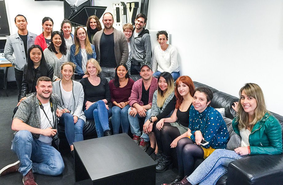
Class photo of the participants in the Type by Hand free workshop at Shillington Sydney
Would you like to attend a workshop?
The next Type by Hand workshop is in Sydney, at Tractor Design School on Saturday October 29th, 2016. Information and bookings can be made here.