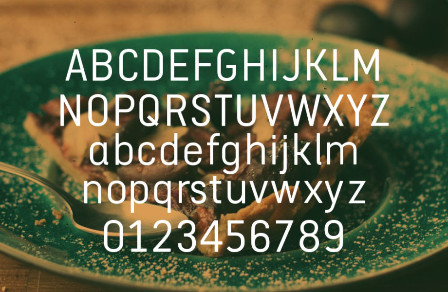
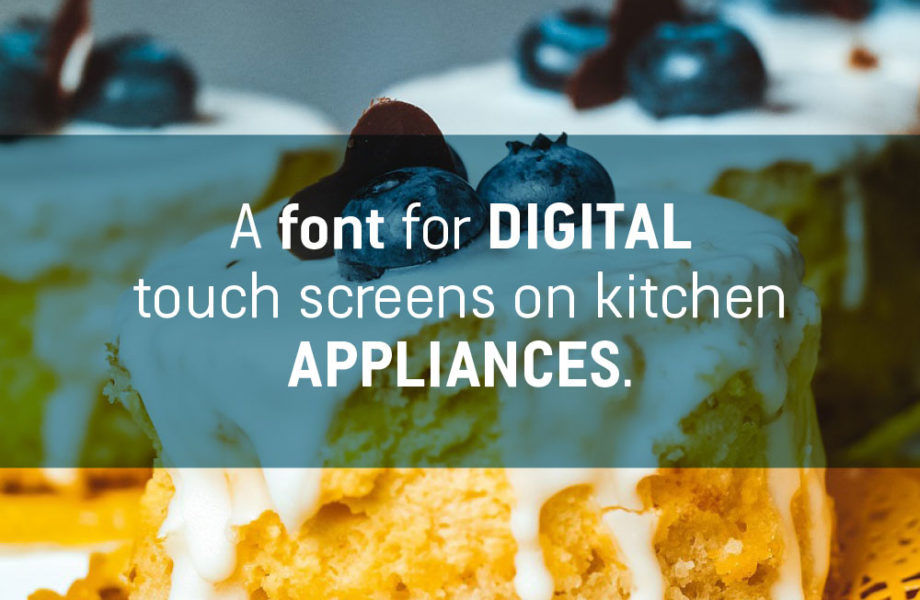
Breville Australia recognised that commercial font licensing was an operational expense they could reduce by commissioning their own unique font. But the font required a very particular design approach due to their unusual target environment: digital touch screens on kitchen appliances. The screens are equivalent in size to a smartphone, so a condensed design was chosen for its economy of space. The font was designed to be legible at particular pixel ratios within the confines of the small-screen, and also provide them with a design that they could fine-tune to their desired creative flavour.
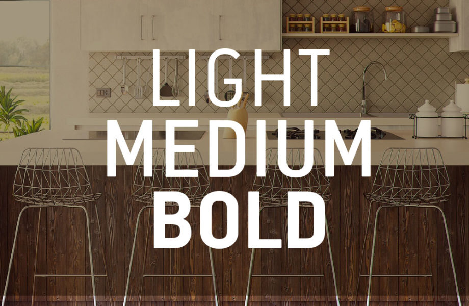
A family of three weights was created, with an extended and customised character set that includes Cyrillic and Greek for the products which are exported to Europe.
- Custom type
- Typeface Design


