The complete ABCSans font

ABC Custom Font Development

By Type Design

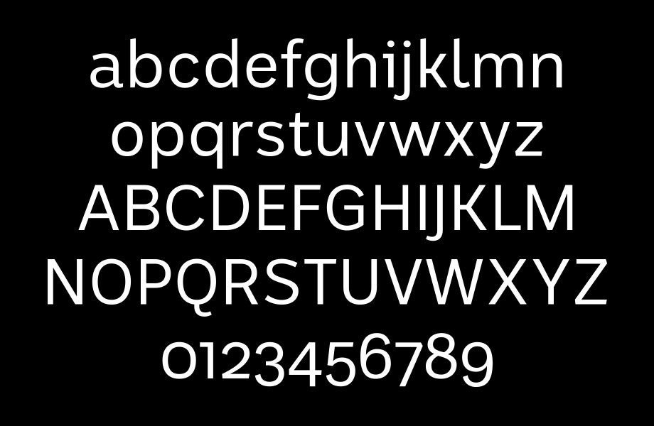
How do you design your country’s national font? This is the story of the typeface you see above – ABCSans. The ABC is Australia’s most trusted media brand. It is loved for its great content, which is available across multiple devices and platforms. So they set out to create a font family which unifies their digital presence across multiple platforms, while also being best-in-class for legibility and accessibility. It was designed to replace the thousands of font configurations in use across the ABC, allow for a proud, uniquely Australian typographical expression, and align with their charter to deliver content that contributes to our…

Read More
Jess demonstrates her handlettering with the word Milkshake

Shillington lettering workshop: Free to experiment.

By Lettering, Workshop

Last weekend I gave a free lettering workshop in Sydney. Attended by 22 eager young designers, the class explored the process of designing and refining a piece of hand lettering from start to finish.   Free? Did I miss out? The class was hosted by Shillington College in Sydney, and was free for all current and former Shillington students. Shillington have hosted many of my workshops in the past, across their studio-like campuses in Brisbane, Sydney and Melbourne. Their generosity has allowed me to teach typography and hand lettering techniques to hundreds of students, so I thought it was time to return…

Read More
A sample of brushpen lettering by Wayne Thompson Australian Type Foundry

Get Better Letters: Tips for Practicing Your Lettering

By Lettering

Apparently, 10,000 hours makes you an expert. I have no idea how many hours I’ve done, but I can tell you that practice alone won’t do it. Here’s some sneaky tricks I have discovered along the way which make my lettering practice more economical: Try to avoid using standard copy paper. It’s very abrasive and can quickly ruin the tips of your brushpens. I find that my Tombow tips start to get furry and lose their clarity quite quickly when using copy paper. What’s the solution? Any paper with a coated or finished surface. Even butcher’s paper, despite it’s ugly…

Read More

Top 5 Sketchbook Tips

By Lettering

When I’m teaching lettering workshops, I like to bring my old sketchbooks along for students to thumb through. I don’t edit the books, they are warts and all. It shows students that we all make mistakes, and that not every piece is successful. I like to explode the myth that successful designers all have pristine sketchbooks, filled with page after page of perfect pieces. And sketchbooks are marvellous at revealing process. So, with that in mind, here are my top 7 tips for keeping a sketchbook: 1. Avoid blank-page syndrome. I keep a list of inspirational phrases, funny words, names etc…

Read More